 List View
INTRODUCTION
It allows to see the components selected that have a certain value.
USE CASES
- The user can make custom lists of components to use without going out of the remote control component to turn on a light
COMPONENT’S PROPERTIES
This component’s sample is made by using Graphic UI gateway.
Please refer to “Gateways / Protocols” guide in order to get further info.
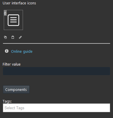
Filter value: It allows to filter components selected for a value. For example, if you want to see the list all the selected switches that are On, in the text field insert 1.
Components: It allows to choose the components to be added to the list.
Selection is carried out by dragging components from “My components” area to the list box.
CLASSIC VIEW MODE
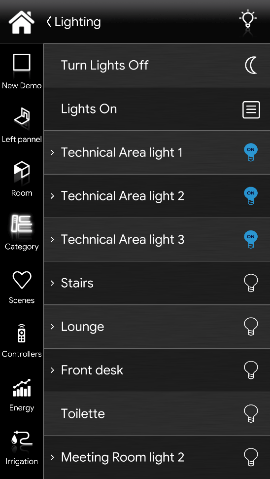
Here is the visual result of the component on EVE Remote Plus (Classic Style).
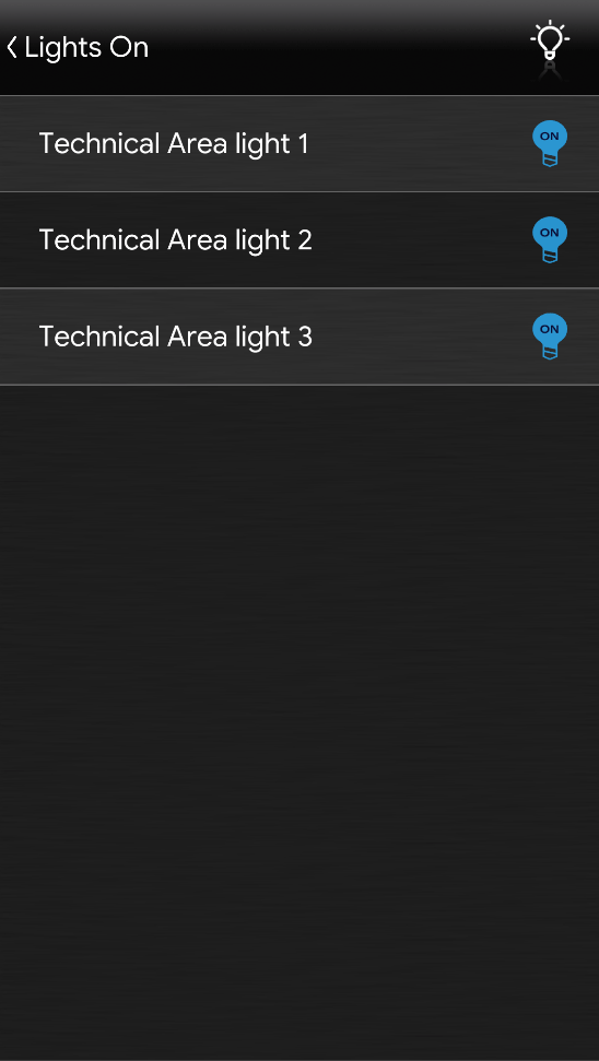
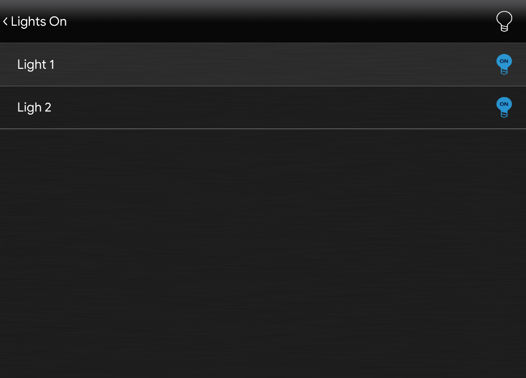
The right hand image displays the lights On. Then on the left side image, it is displayed the list of the lights that have On as their current state.
List View is displayed with the following mask:
List View ⇒ List View mask
![]() Default mask (List View mask)
Default mask (List View mask)
MAP VIEW MODE
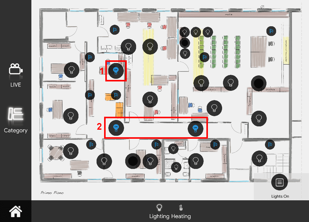
Here is the visual result of the component on EVE Remote Plus (Map Style).
In this case, only the components that have ON as their value will be displayed within the list. This is because the list view component has 1 set in its filter value parameter.
Icons can be customized depending on your necessities from symbol to color and dimension.
In this case, we can see the default icon layout:
List View ⇒ List View icon
![]() Default icon (customizable icon)
Default icon (customizable icon)

