 Chart
Chart
INTRODUCTION
This component allows you to create graphs using gathered information and to display them in the user interface. Each information deriving from a sensor, or counter, or switch can be used to be represented in a chart.
USE CASES
- With the Chart component you can check the energy production the consumption of your home, building, hotel, etc.. over time
A reminder before continuing:
Before using this component it is recommended to view the technical guides of the following components to fully understand the process of configuration of the component Chart:
COMPONENT’S PROPERTIES
GUI
This component’s sample is made by using Graphic UI gateway.
Please refer to “Gateways / Protocols” guide in order to get further info.
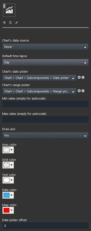
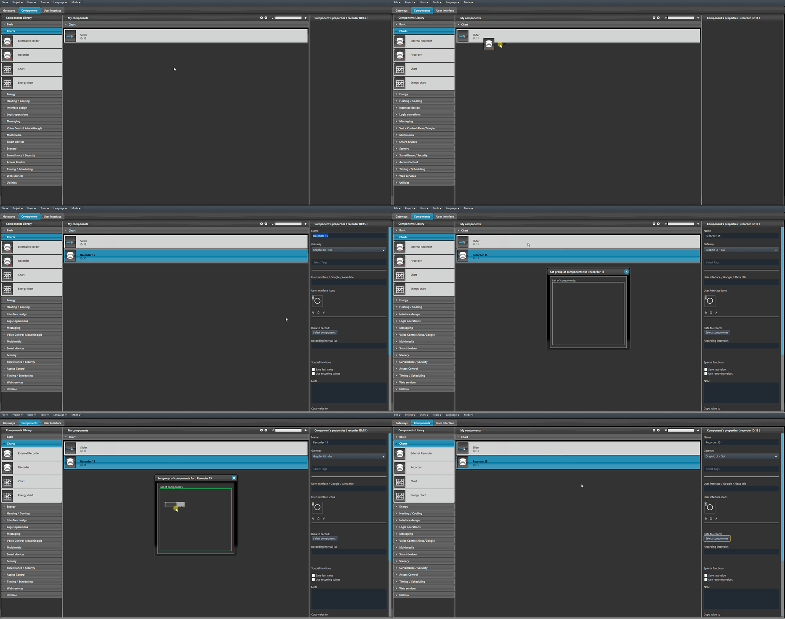
You can choose from any Recorder‘s component which data you want to record.
Default time lapse: Time lapse of the chart’s data visualization that will be set as default once the chart is opened insid the user interface (Day, Week, Month, Year);
Chart’s date picker: Date picker component that allows the chart’s date selection on the user interface;
Chart’s range picker: Drop Down component that allows the chart’s range selection on the user interface;
Min value: Min axes’ value, leaving this field empty will set automatically the scale’s values;
Max value: Max axes’ value leaving this field empty will set automatically the scale’s values;
Draw axis: Allows to enable or disable the drawing of the graph axis, in the map view mode it will allow overlapping one or more graphs;
Axes color: Color that will be applyed to the chart’s axes;
Grid color: Color that will be applyed to the chart’s grid;
Text color: Color that will be applyed to the chart’s text;
Data color: Color that will be applyed to the chart’s data;
Date picker offset: Allows you to watch different graphs on the same map using different time intervals;
 EVE Remote Plus
Three different view mode possibilities: “CLASSIC”, “MODAL” and “HIDDEN”. Learn more about the component’s view modes.
COMPONENT INTERFACE VISUAL RESULT
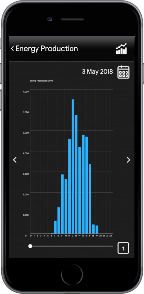
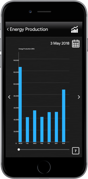
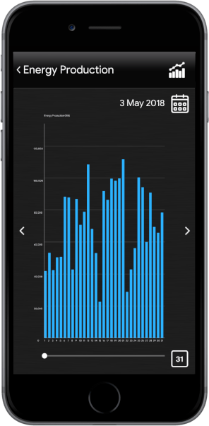
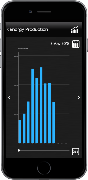
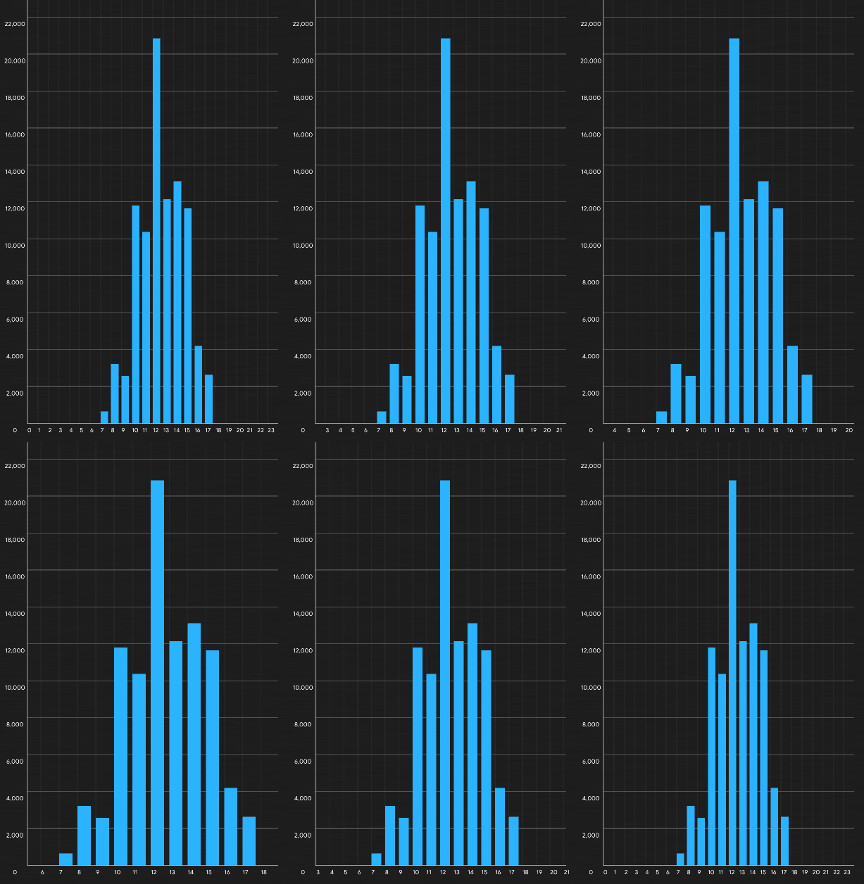
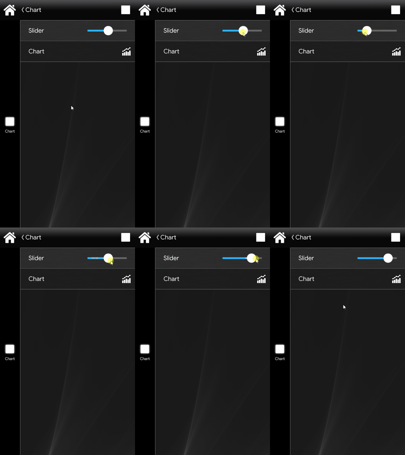
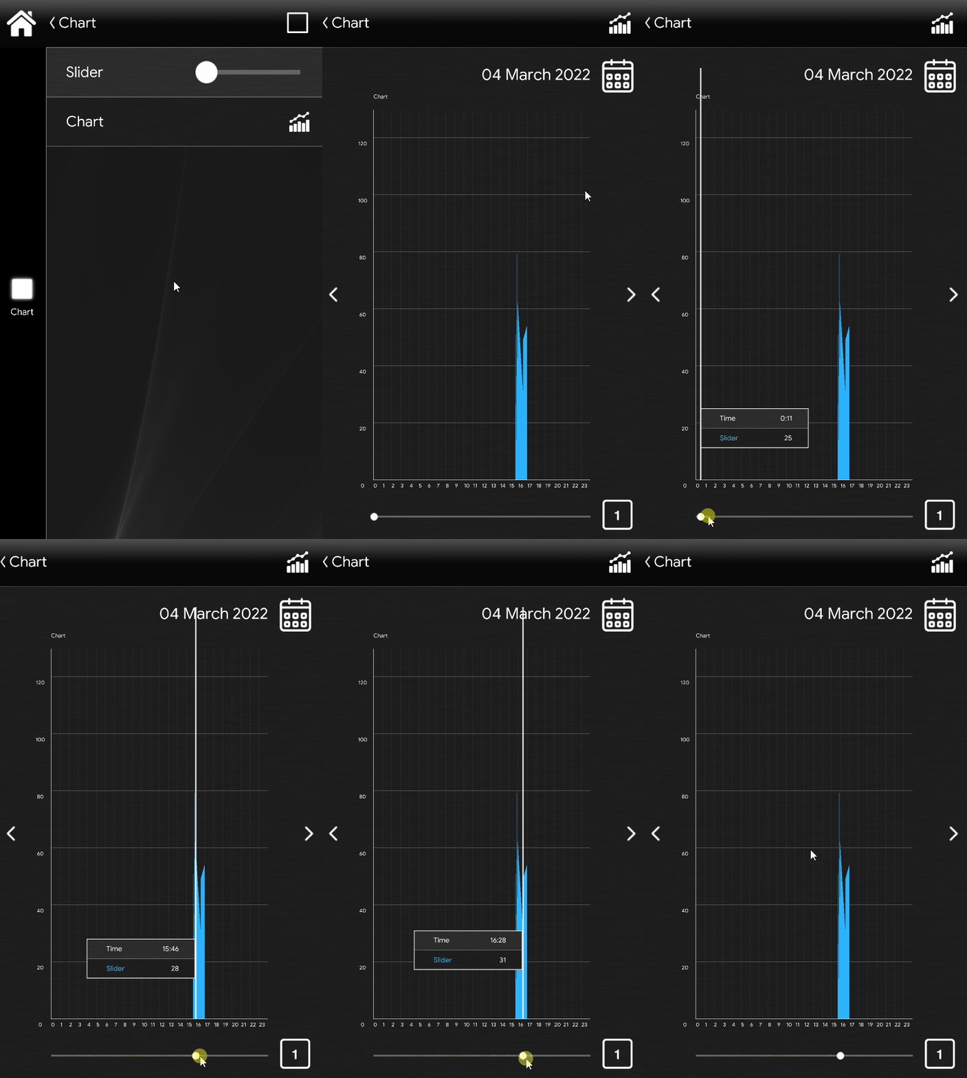
The different time views are displayed in the user interface
Chart’s interface inside the EVE Remote Plus app (Classic and Map)

The chart’s date is shown next to the date picker Icon
Chart’s date picker icon. Tap on it to change the date.
Move it forward and back to analyze chart’s data.
Chart’s range picker icon. Tap on it to select a different time lapse (Day, Week, Month, Year).
How to set up a Chart (test project)
TEST PROJECT INTRODUCTION
This is a step by step guide that shows how to set up a chart component. with virutal components, with the EVE-Ghost. Here you will learn how to set up a Chart component from scrach, from its basics to the User interface visualization.
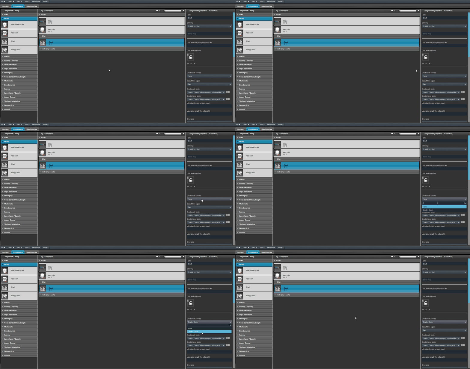
Add a new Chart component in the project, then select the wanted data source from the “Data source” drop down menu in component properties.
Once the data source is choosen you can now add the chart component inside the User interface, in this test we are using the Classic user interface. Enter the “User interface section by selecting it from the section menu and add a new main menu icon then add the Slider component in the user interface editor component inside the third level of the editor (Picture 1). Then upload the project into the server filling up the conection parameters in the Upload window (Picture 2).
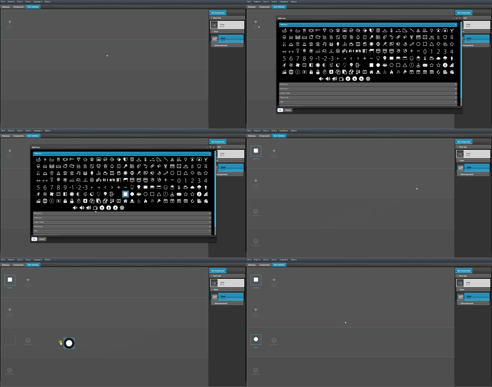
Picture 1
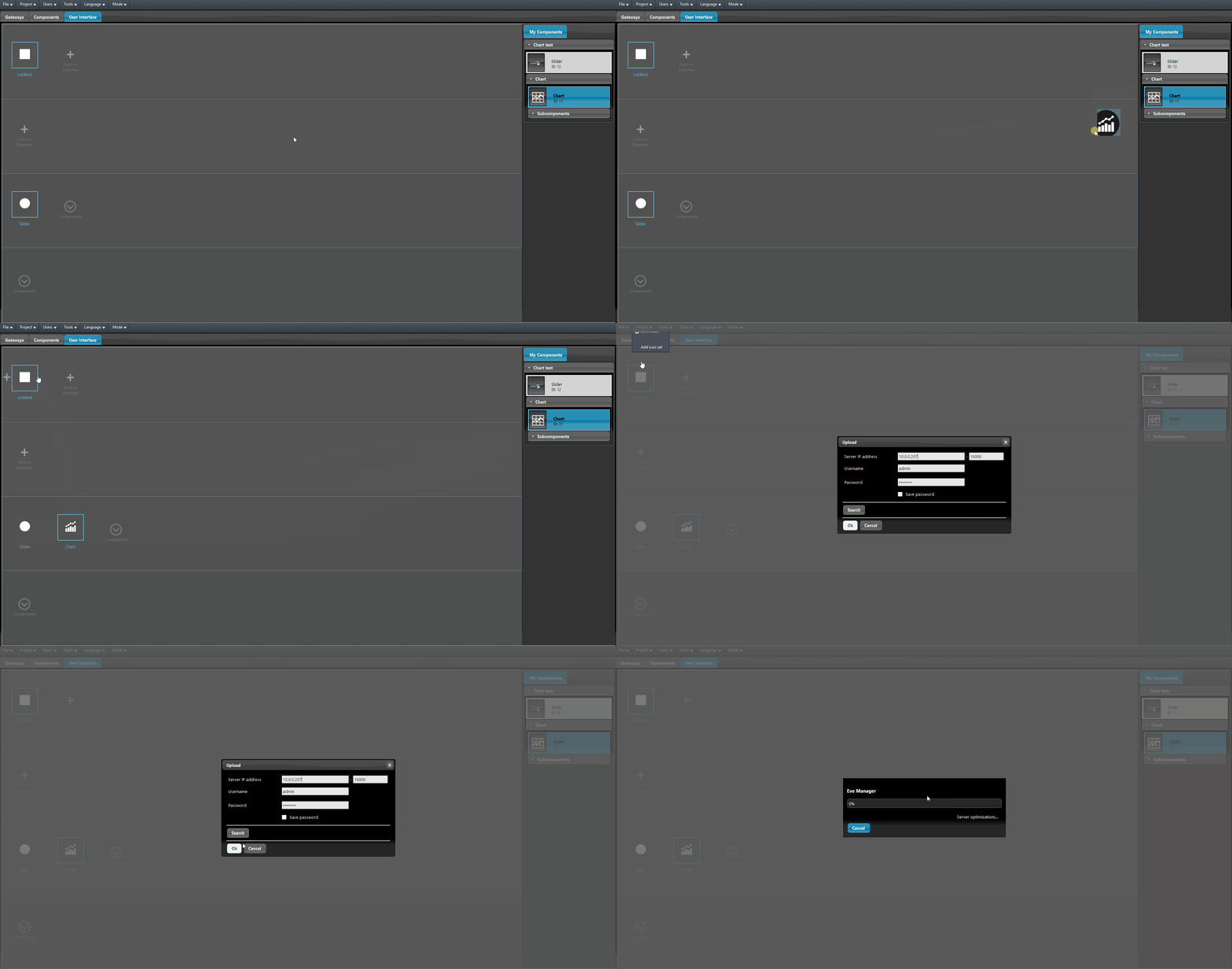
Picture 2
The Recorder need the logic module up and running in order to record data. In order to display the data inside the chart the recorder needs to record the data, in this case the data will be recorded every time the Slider moves. The recorded data will be compared each minute with the data recorded the minute before in case of a dense data recording.
By clicking the chart component icon you will enter its user interface, here by dragging the slider on the bottom of the interface, allows you to consult the data recorded.
Click the link below to download the Chart’s demo project and try it your self.

