CLASSIC USER INTERFACE
INTRODUCTION
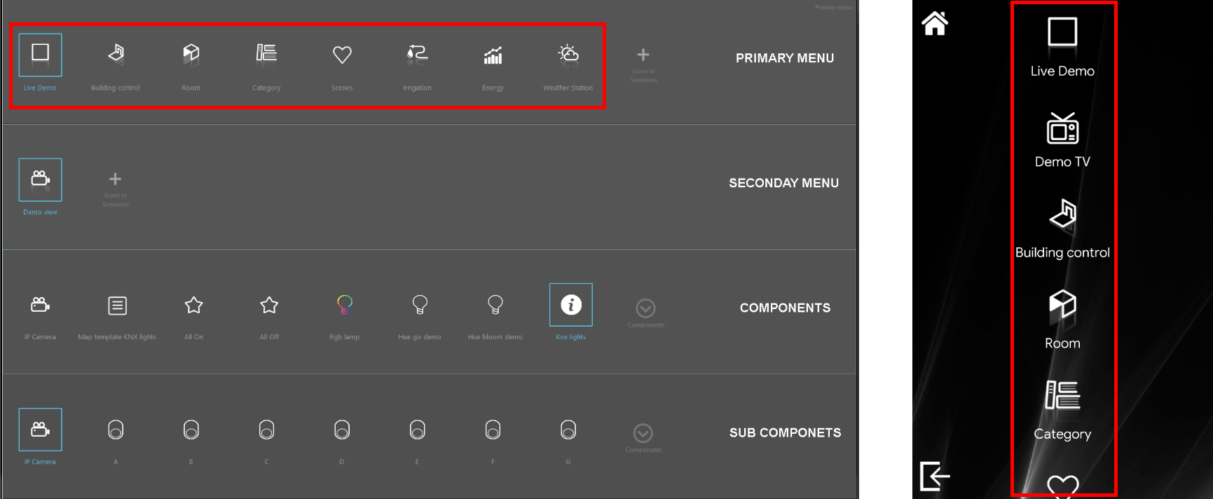
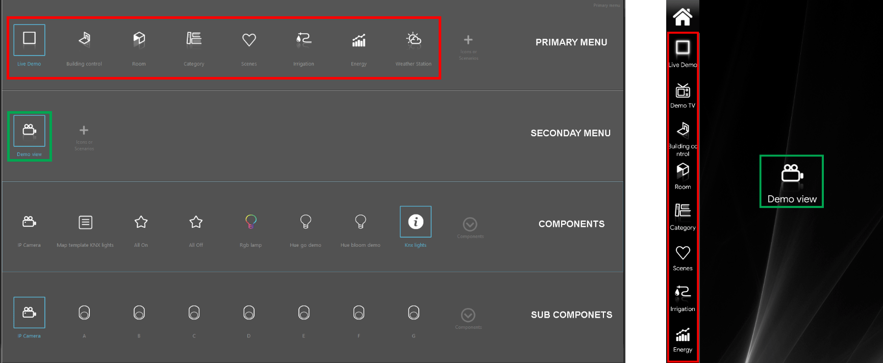
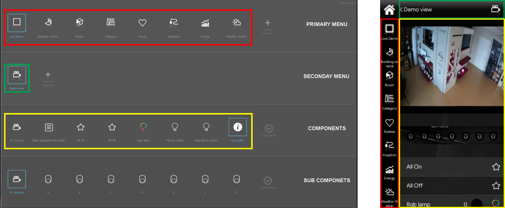
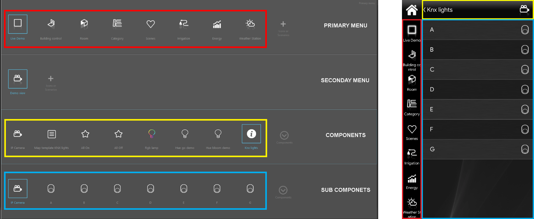
The creation of a “Classic” interface is designed to run on a 4 menu (from top to bottom):
- Primary menu: only icons (from Icons tab) or scenarios (from My components tab). This is the starting point of all the structure;
- Sub menu: only icons (from Icons tab) or scenarios (from Components tab). This menu is optional;
- Componets: only components or scenarios (from Components tab). Menu filled depending on necessities.
- Sub components: only components and scenarios (from Components tab). Menu filled up by necessities.
Final result
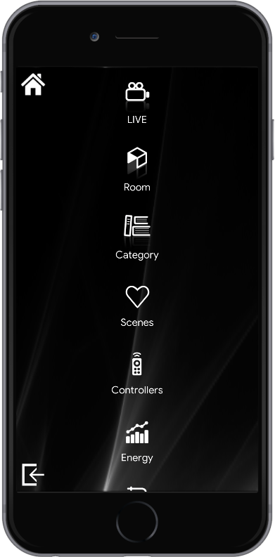
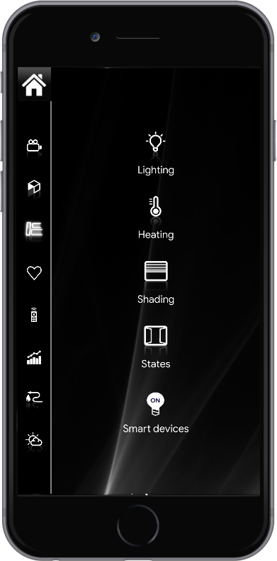
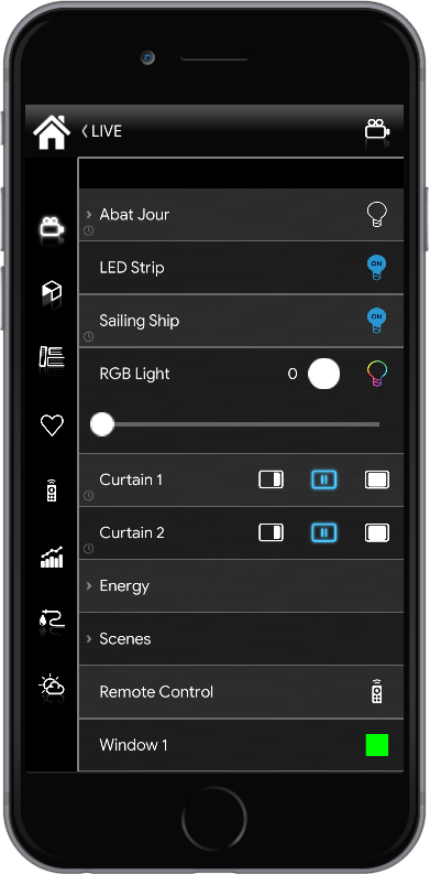
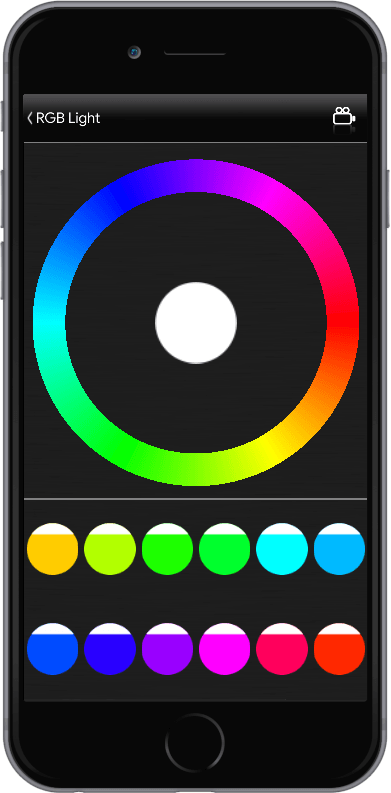
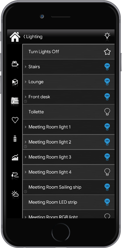
In the following images is shown the result of the above configurations made in the User Interface editor. From left to right you can see an overview of all the Interface levels. As said, the first and second levels allows the categorization of elements, the third and fourth levels are made for the components interaction, each one with its defined icon.
In order to consult all the components’ configuration we suggest you to check out our Components library for further information.
Scenarios management
A specific exception is done for Scenario component: scenarios can be placed on each level but the visual result is different. If scenario component is placed on first and second levels its icon can be customized. If scenario component is placed on the third level its icon will be the one chosen by default from the system (the star).
Customization
The creation of a Classic interface saves a lot of time regarding the personalization since the choices are reduced to benefit a very organized and easy insight interface for anyone. It is still possible to make customizations as regards the choice of the icon, the color and the text of each object. To do this just do double click on the specific icon and the icon editor window will appear to let you make changes.
Note. When considering a component, any change made on the Interface tab (name and icon) won’t be applyed on the component’s tab and vice versa, if you edit components’ name and icon from the Component’s parameters area of the Component’s tab, the change will automatically be considered on your user interface. Please refer to “Component’s parameters” guide.

