MAP USER INTERFACE
INTRODUCTION
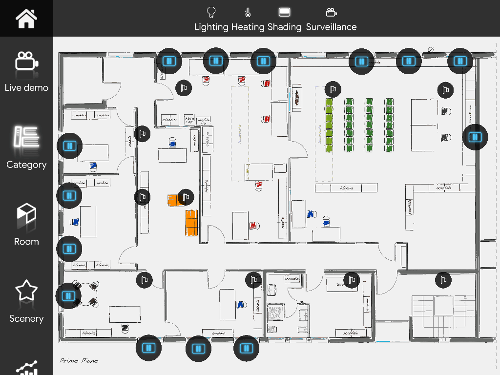
The creation of a “Map” interface develops in two layers:
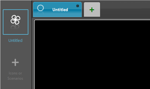
- Primary menu (on the left): Only icons (from Icons tab). This is the primary bar, the main menu of the user interface;
- Secondary menu (on the top): Only icons (from Icons tab). This is the secondary bar that looks like the excel sheets bar.
The creation of the Map interface provides a pyramid structure: for each selected object of the above layer corresponds a specific understructure. To each icon of the primary menu corresponds a secondary menu. To each icon of the secondary menu corresponds a sheet (canvas area) where to arrange your components.
Visual result
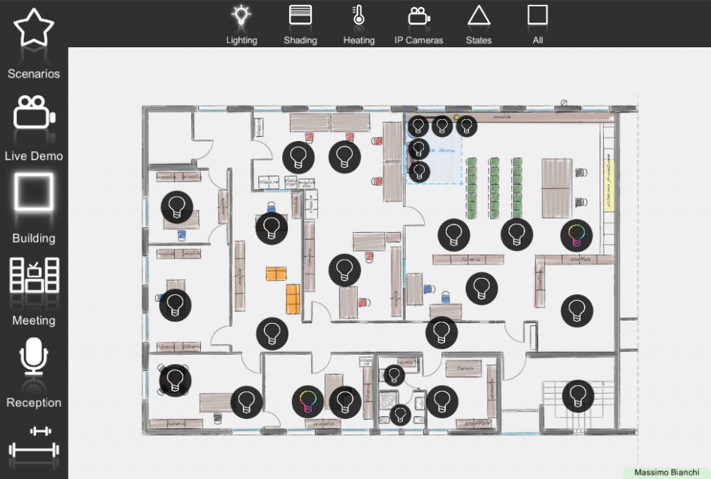
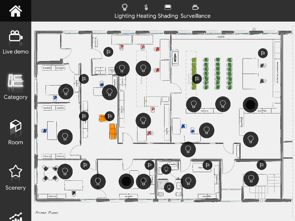
Below it is possible to see the visual result of what we have just created. As we said, primary and secondary menu allow to categorize. Instead, the canvas area is dedicated to the components control, each one with its own defined command icon. In order to get an idea of the visual result of each component please refer to the dedicated component’s guide starting from “Components library” guide.
The creation of a Map interface can be very meticulous because no choice is left to chance and customization is possible at 100% as regards the choice of the icon, the color and the text of each object. This to benefit a unique interaction with images, icons, text data and the user interface in general.
Here is a list of all the features you are allowed to customize:
- Interface dimensions: please refer to the interface settings of the “User management” guide;
- Background image: please refer to the interface settings of the “User management” guide;
- Bars position and color: please refer to the interface settings of the “User management“;
- Sheet background and color: it is possible to set a different background and color for each new sheet;
- Icons and titles: please refer to the interface object editor of the “Icon editor” guide;
- Customized icon set: please refer to the “New icon set” guide;
- Component’s icon and titles: please refer to the interface object editor of the “Icon editor” guide.
Note. When considering components, any change made on the Interface tab will not be considered on the Component’s tab. Vice versa, if you edit components’ icon and icon’s color from the Component’s parameters area of the Component’s tab, the change will automatically be considered on your user interface.
Tab management
First of all let’s see how to add secondary menus:
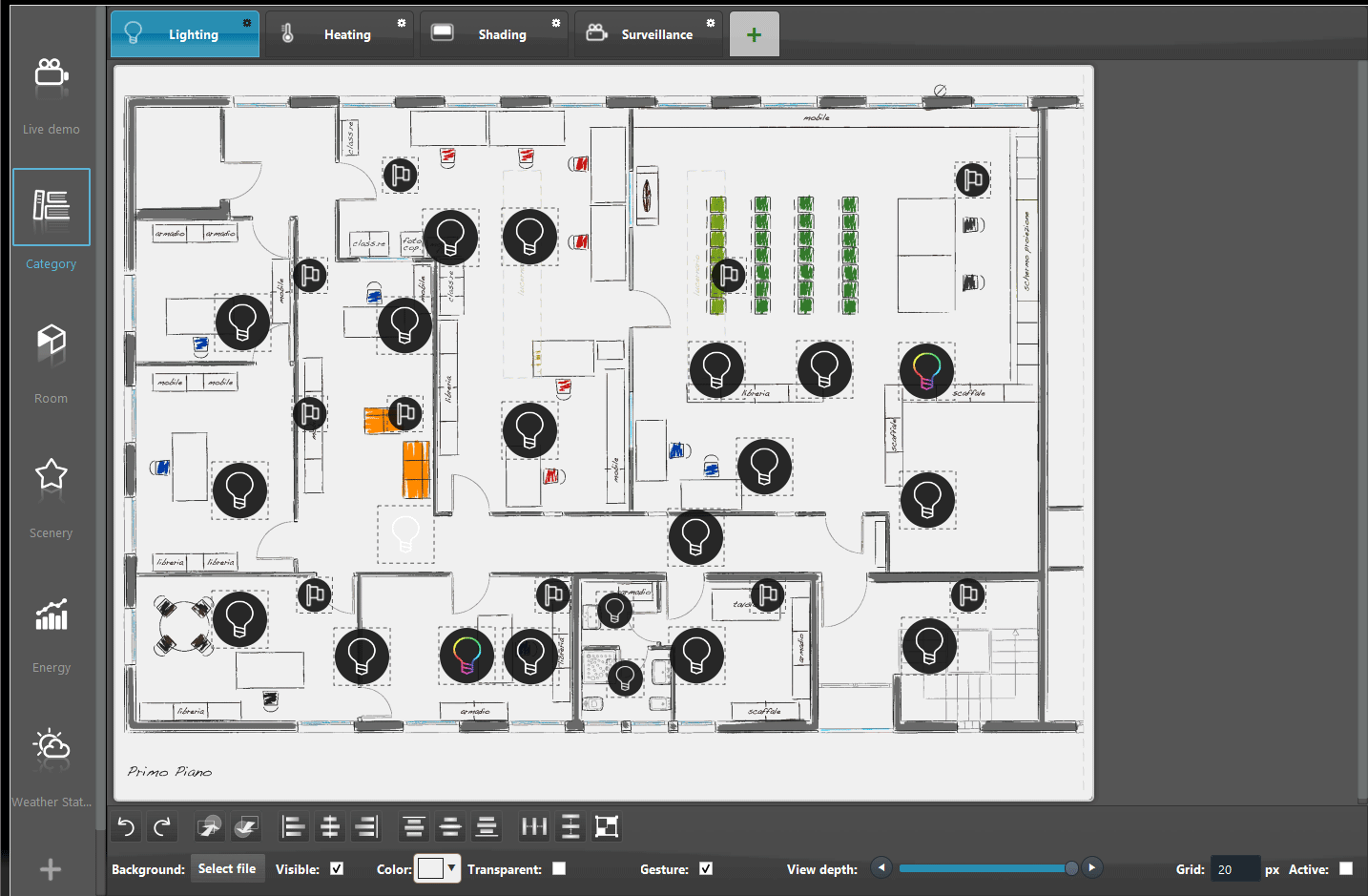
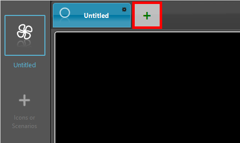
Click the “+” tab in order to add a new secondary menu for the specific selected icon of your primary menu. In order to edit title and icon of the sheet just click the setting icon on top right of the tab’s corner. You are allowed to create as many secondary menus as your project requires.
You can easily move a sheet before or after another just dragging it.
INTERFACE TOOLS BAR
As said, you are allowed to set a different background and color for each new sheet.
Below the canvas area of any new sheet you are allowed to manage few other options:
- Background: It allows to select a specific image for the selected sheet (pay attention to the dimensions);
- Visible: Check box that defines if the set image has to be visualized or not on the interface;
- Color: It allows to select a specific color for the selected sheet (it will cover the system background image);
- Transparent: Check box that defines if the set color has to be visualized or not on the interface;
- Gesture: This checkbox enable or disable the opportunity to zoom in/out or drag the image pannel though its surface;
- Grid: Pixel value of your interface grid. It allows a better array of the components on the sheet;
- View dept: This slider allows the editor to go back and forth among all the interface’s levels added by placing the components;
- Active: Check box that defines if the grid function is activated or deactivated.
There are many other functions available on Map interface creation. These functions are listed on the context menu.
COMPONENT MAP TOOLS EDITOR
This section of the Map interface Editor allows the User to tidy up and organize the components inside the user interface.
|
Undo & Redo
|
These two buttons allow the user to undo or redo action done in the User interface Editor |
|
Move to back & Move to front
|
These two buttons allow the user to modify the selected component’s interface level. |
|
Align to the left, center or right
|
These three buttons allow the user to regroup the group of components selected to the left, center or right. |
|
Align to the top, middle or bottom
|
These three buttons allow the user to align the selected group of components to the top, middle or bottom. |
|
Distribute evenly horizontally, vertically or group shapes
|
These three components allow the editor to distribute evenly within the map interface the components selected. |
Redo & Undo

This two buttons allow the user to undo or redo action done in the User interface Editor.
Move to Back or Move to front

This two buttons allow the user to modify the selected component’s interface level.
Align to left, center or right

These three buttons allow the user to regroup the group of components selected to the left, center or right.
Align on top, middle or bottom

These three buttons allow the user to align the selected group of components to the top, middle or bottom.
Distribute evenly vertically horizontally or Group shapes

These three components allow the editor to distribute evenly within the map interface the components selected.

