 Slider
INTRODUCTION
The slider is the component that represents a percentage. The percentage control of a dimmer is performed by the Slider. If it is necessary to indicate a value other than 100 as the maximum value, you can change the default settings. It is also possible to subdivide the percentage at various points and define what icon should be used for each interval.
USE CASES
- You can use the cursor component to dimmer the lights, or you can use it to move flats on the shatters.
COMPONENT’S PROPERTIES
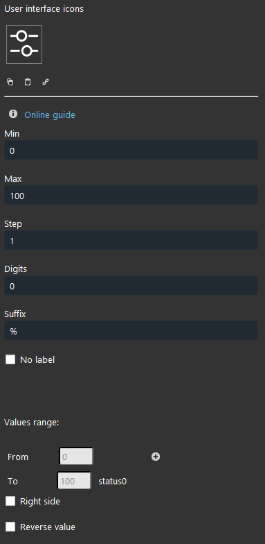
Min: Minimum value from 0 to 100;
Max: Maximum value from 0 to 100;
Step: Step value from the previous and the following change;
Digits: Digits after the comma;
Suffix: Unit of misurement that will applied visually in the user interface to the displayed value;
No label: it allows to hide the component’s label on the interface visual result;
Value range:
From: Lowest value;
To: Higher value;
You can add a new range. Select the “+” icon and a new icon will be created to identify the new range.
KNX
This component’s sample is made by using KNX gateway.
Please refer to “Gateways / Protocols” guide in order to get further info.
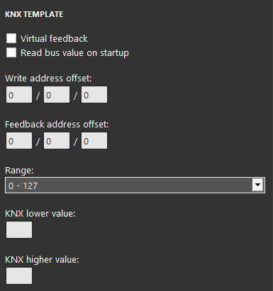
Virtual Feedback: Please refer to
Read bus value on startup: Please refer to “KNX protocol” guide;
Write / Feedback address
Range: It depends on the object set on the ETS database of the KNX module.
 Ilevia Control
Three different view mode possibilities: “CLASSIC”, “MODAL” and “HIDDEN”. Learn more about the component’s view modes.
CLASSIC VIEW MODE
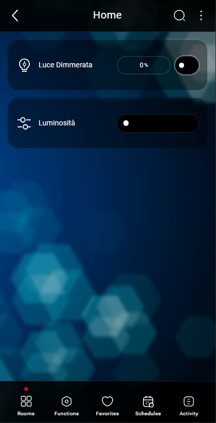
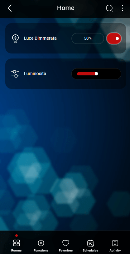
Here is the visual result of the component on Ilevia Control (Classic Style).
Sliders are displayed as sliding bars which light up along the way.
![]() Sliding bar 0% (slider mask) Picture 1
Sliding bar 0% (slider mask) Picture 1
![]() Sliding bar 50% (slider mask) Picture 2
Sliding bar 50% (slider mask) Picture 2
MAP VIEW MODE
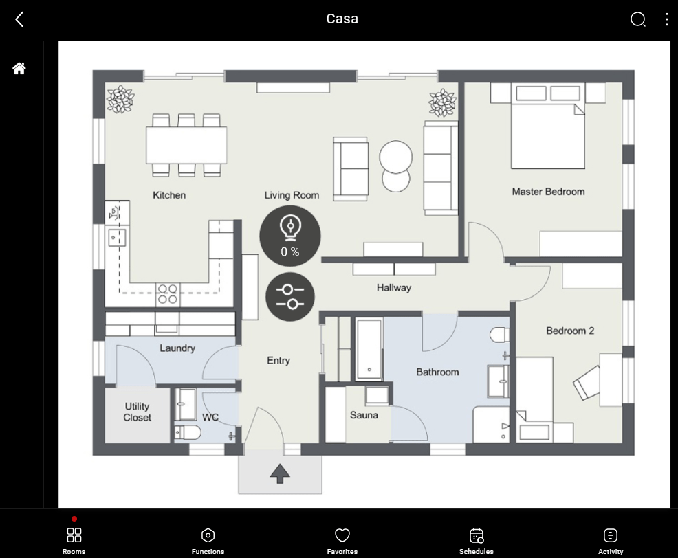
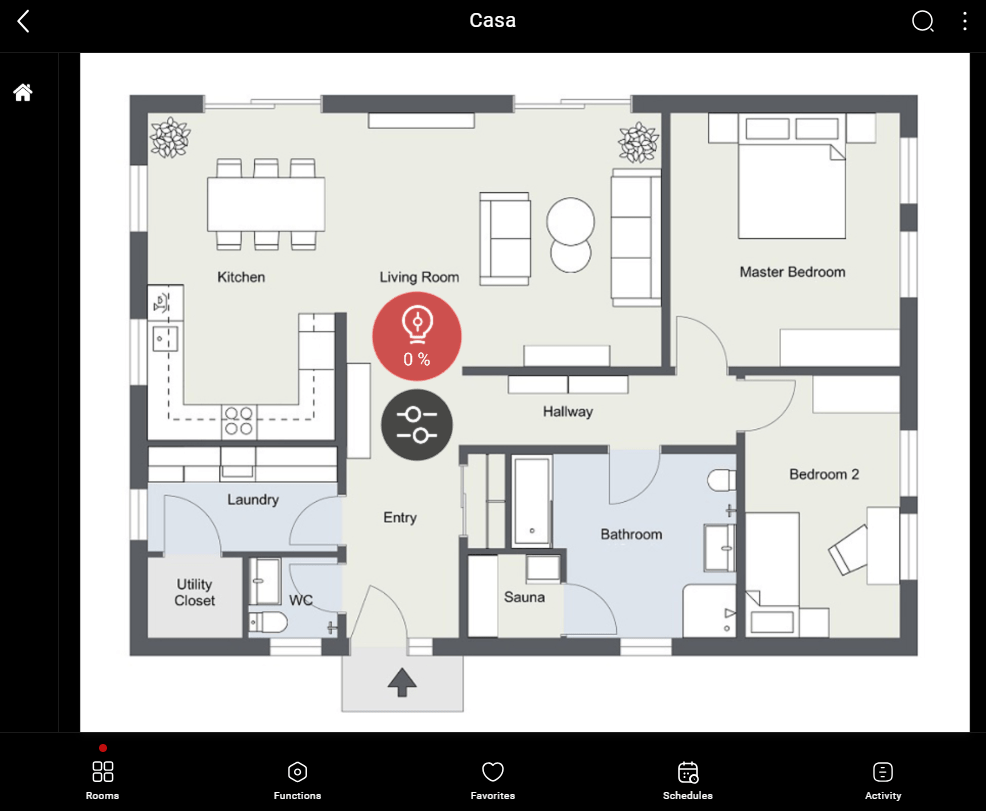
This is just one of the visual result possibilities of the component on the Ilevia Control (Map Style).
Icons can be customized depending on your necessities from symbol to
In this case, we can see the default icon layout:
![]() Sliding bar Picture 2
Sliding bar Picture 2

