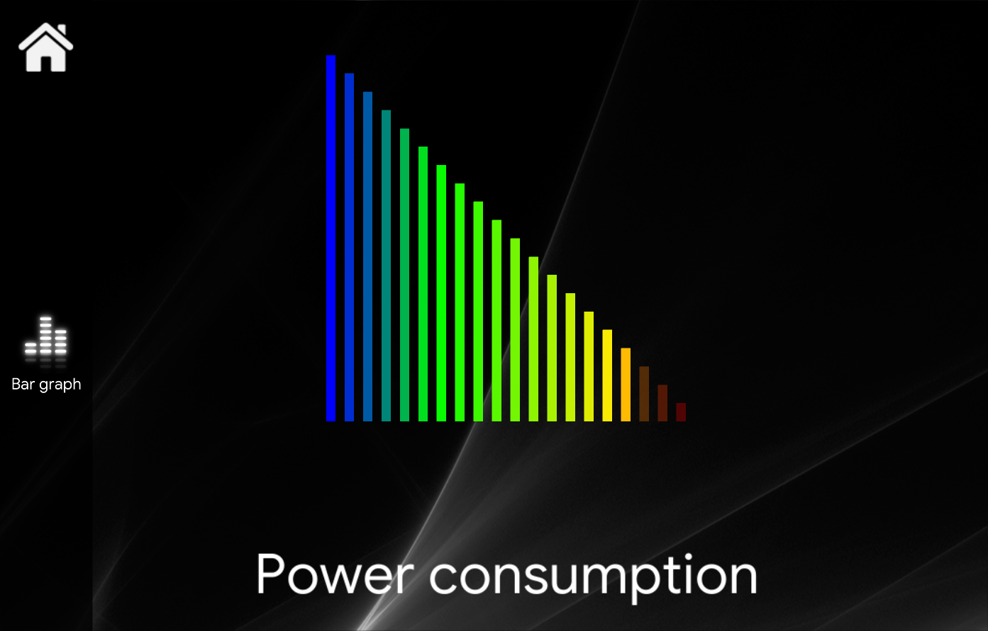
 Bar Graph
INTRODUCTION
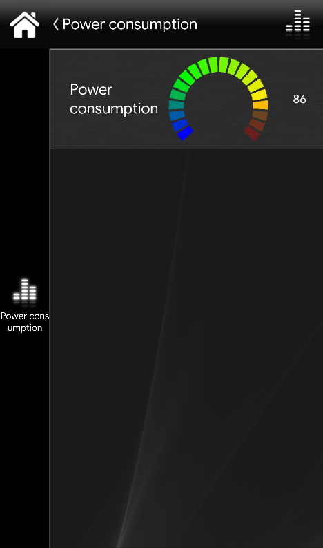
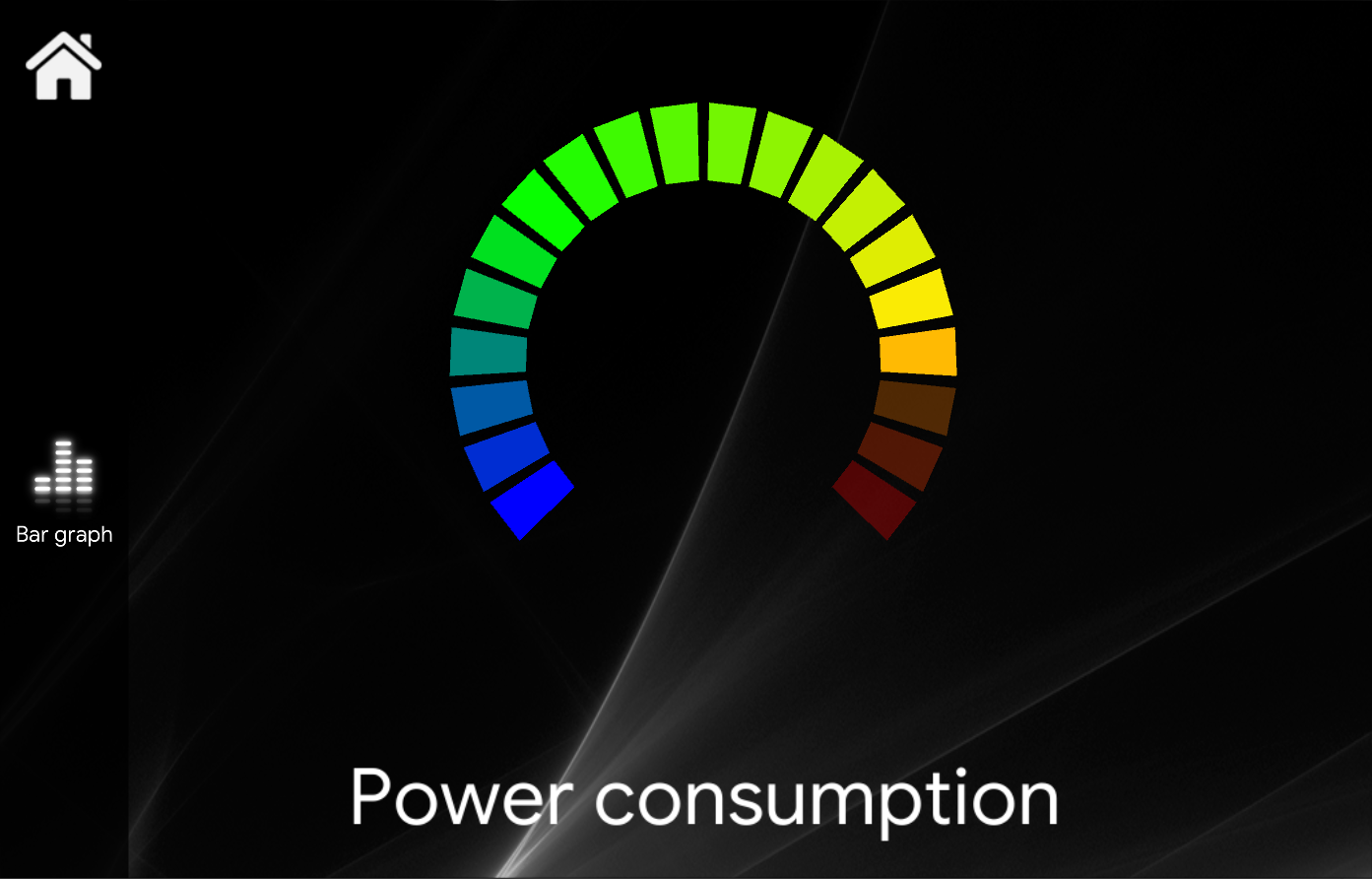
It is used to represent values using histograms or speedometer with
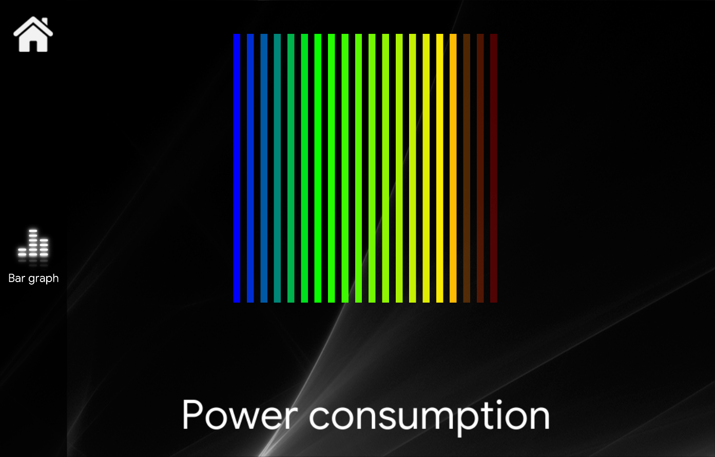
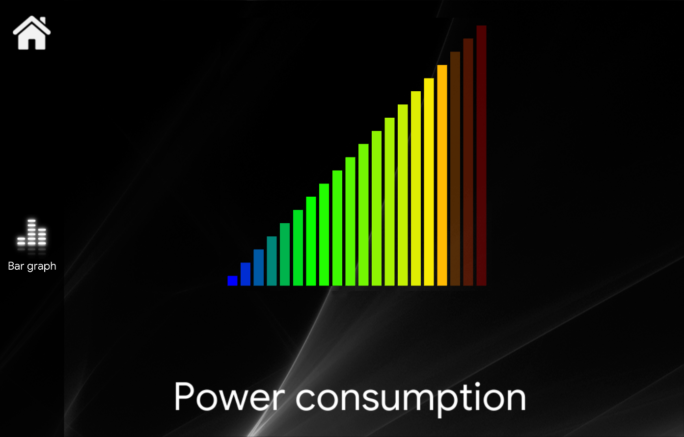
There are several layout options which define how the value should be visualized.
USE CASES
- You can use this component keep track of the current power that your solar plant is producing in real time.
COMPONENT’S PROPERTIES
GUI
This component’s sample is made by using Graphic UI gateway.
Please refer to “Gateways / Protocols” guide in order to get further info.
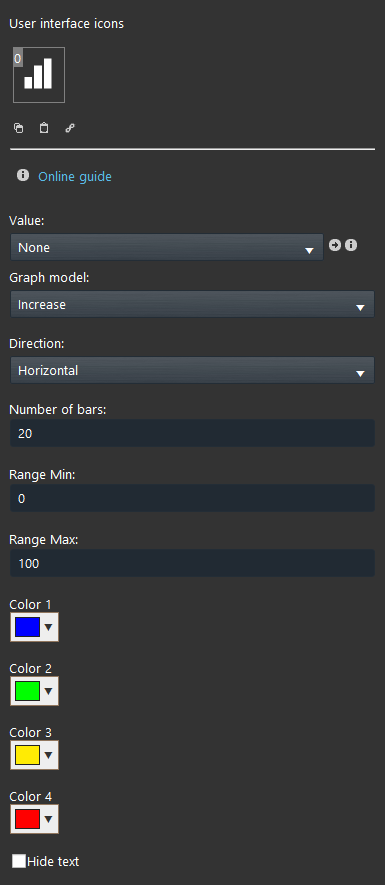
Value: Select the Info, Dimmer, Seeker, Changeable Value, Slider, Set point you want to represent on the graph;
Parameters:
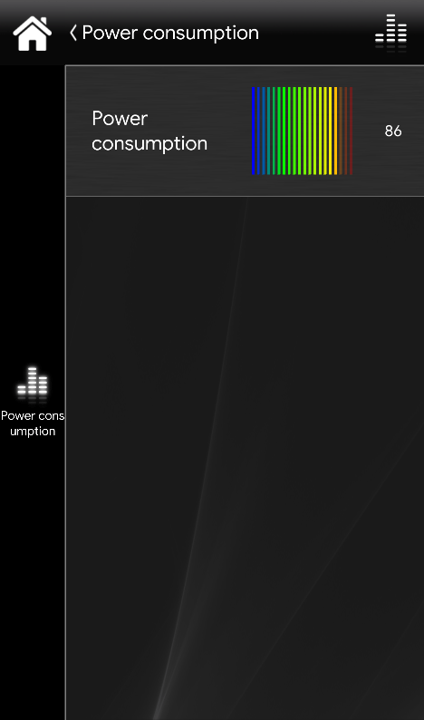
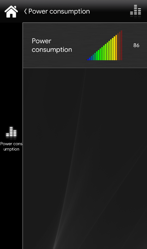
Graph model: Choose the graph model between square, circle, increase or decrease;
Direction: Choose the direction of the values when increasing on the chart;
Number of bars: It defines how many bars make the chart;
Range min : Minimum value of the chart;
Range max: The maximum value of the chart;
Color: Choose each color of the graph bars (left click on the box). You can choose multiple colors to create a customized graph according to your needs;
Hide text: This checkbox allows you to choose to toggle the display the text the value coming from the component you linked to this specific Graph bar.
CLASSIC VIEW MODE
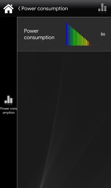
Here is the visual result of the component on EVE Remote (Classic Style). It is possible to edit the dimensions of your Bar Graph according to your necessities. Also, you can add as many Bar Graph as you need in the same user interface tab.
MAP VIEW MODE
Here is the visual result of the component on EVE Remote (Map Style). It is possible to edit the dimensions of your Bar Graph depending on your necessities. Also, you can add as many Bar Graph as you need in the same user interface tab.

